Discover how to add depth to any room by combining texture and tone. Whether you’re refreshing a bedroom or reinventing a living room, combining the right tactile feel with just the right shade can dramatically change how a room is perceived. By focusing on subtle nuances in your material composition, you can create an inviting atmosphere that showcases depth, contrast, and visual appeal in every corner. Below, you’ll find practical ideas for incorporating surface quality, color depth, and pattern intricacy for a more dynamic room.
Contents
- 1 Focus on surface quality to elevate design elements
- 2 Bring out color depth with subtle nuances
- 3 Harness material composition for richer tactile feel
- 4 Infusing artistic expression into everyday design
- 5 Achieving design balance with tonal and textural contrast
- 6 Emphasizing ambient mood with the right color and texture pairing
Focus on surface quality to elevate design elements
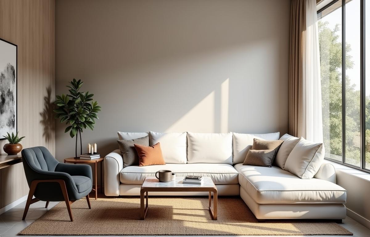
Surfaces define so much of our overall sensory experience. They bring tangible dimension that goes beyond flat color and shape. When thoughtfully curated, surface quality can be a focal point that underscores color depth and layered effects. Elements like wood grain pattern, paint texture, and fabric weave all add a tactile dimension that enhances design balance.
It helps to look closely at how each surface selection interacts with light reflection and structural feel. Some materials have a smooth, glossy finish that amplifies brightness, while others come with a matte or rough quality that absorbs and softens light. If you lean on acoustic texture in wall coverings or rugs, these can also provide a calm, cozy vibe in addition to their core aesthetic appeal. Keep in mind that mixing a few different surface finishes will emphasize visual consistency within your room, as well as spur artistic expression.
Bring out color depth with subtle nuances
Color depth shapes mood, influencing how spacious or intimate a room feels. Tones that are richly saturated can energize your environment, whereas subdued shades might evoke tranquility. It’s often about drawing out the right perceptual qualities from each color so people feel at ease the moment they enter.
Blend in subtle nuances by pairing complementary tones that highlight contrast in tone without jarring the senses. Try accenting certain areas with bolder variations, layering them with more neutral or muted tones in adjacent spaces. Light reflection plays a crucial part here, so adjust how much natural or artificial light you use to accentuate the change in intensity. This approach contributes to an overall style definition that feels cohesive while retaining a creative technique for visual intrigue.
Balancing contrast variation with layered effects
When it comes to introducing contrast variation, strike a balance that feels comfortable rather than overwhelming. A pop of deep gray behind a crisp white sofa, or a bold accent wall against calm neutrals, can enhance dimension without dominating everything else. Layered effects include contrasting textures like rough stone next to soft upholstery, or high-gloss tiles adjacent to brushed metal elements. These strategic interactions of texture and tone guide the eye across the room, revealing different facets of your design as you move through the space.
Harness material composition for richer tactile feel
Material composition impacts how you experience a room through both sight and touch. For instance, a space that incorporates a woven rug paired with smooth marble counters instantly exudes variety. This interplay of tactile quality helps you appreciate each design element more vividly. Surface variation also goes beyond natural materials synthetic blends, metallic accents, and other innovative finishes can bring about a modern or eclectic vibe.
Consider how each component you add will feed your design balance. Sometimes a single statement piece, like an intricately patterned textile or an unusual metal fixture, can ground the entire room. Pay attention to pattern intricacy as well, ensuring your chosen design elements have enough subtlety to work in harmony without clashing. Even the warmth of skin tone in a portrait or the grain pattern on wooden beams can promote interest while sustaining aesthetic harmony.
Encouraging element interaction through layered textures
Layering different materials is a great way to spark element interaction. Imagine pairing a plush throw blanket on a linen sofa, with a knotted jute rug underfoot. The contrast feels tactile yet visually appealing. In the same room, adding an elegant piece of pottery or sculptural art can enhance the sense of layered effects. Each object or textile weaves a story of texture and tone that keeps the eye discovering fresh details.
Infusing artistic expression into everyday design
Artistic expression in interior design doesn’t have to be confined to galleries. You can integrate creative technique into your home by experimenting with 3D surface mapping on decorative walls or by hanging artwork with intriguing photographic tone. By leaning on digital texture for wallpaper or large-scale prints, you open countless possibilities to showcase color saturation and pattern intricacy.
When you consider the role of visual consistency, you’ll notice that each material finish must complement the rest. A modern metal pendant lamp could team beautifully with accent pillows featuring a bold geometric pattern. Meanwhile, a hand-painted mural next to a refined sofa might deliver that layered contrast which breaks monotony. The key is to maintain an ambient mood that resonates with your personal style, ensuring each piece supports the overall theme rather than conflicts with it.
Tapping into subtle color shifts for added depth
If you want to build layers without overwhelming the senses, explore hue uniformity within the same color family. This approach provides a sophisticated background upon which you can layer contrasting pieces. Small adjustments like choosing furniture in a shade slightly darker than your walls create a soft dimension. Likewise, accent pieces in a lighter tint can pull the entire color palette together. By tweaking color saturation in your accessories, you align textural accents with the foundation you have established.
Achieving design balance with tonal and textural contrast
Design balance is about shaping how the eye moves around a room offering just enough contrast without turning your space chaotic. It helps to define your style definition, whether bohemian, minimalist, or something in between. Steering your choices for furniture, fabrics, and decorative accessories with a clear vision ensures each element steadies and complements the rest.
One way to craft this balance is to place a distinctly textured item next to a smoother piece. For example, if you have a velvet armchair, consider flanking it with a side table that has a sleeker material finish. Likewise, the paint texture on a feature wall could be accentuated by more subdued tones in the rest of the room. This interplay ensures that every piece gets its moment without overshadowing others.
Creating mood shifts through tonal variation
Sometimes, a slight change in hue or intensity dramatically affects how a room is experienced. If you opt for a pastel palette, adding a few vibrant splashes of color depth can bring life to an otherwise tranquil setting. Conversely, if your space leans toward darker shades, scattering a few lighter elements can prevent a heavy or cramped feel. The interplay between strong and subtle hues encourages aesthetic appeal, providing both comfort and unique interest.
Emphasizing ambient mood with the right color and texture pairing
Ambient mood isn’t just about lighting or paint selection it involves a harmonious blend of all the factors at play. Blend a carefully chosen color scheme with thoughtful material composition for an environment that feels welcoming and simultaneously inspires admiration. Look at fabrics and finishes that highlight the layered effects you’re aiming for. If you prefer a calming vibe, incorporate neutrals with soft, tactile surfaces. If drama is your goal, go for bolder colors with high contrast in tone and sharper textures.
Though it’s tempting to follow rigid rules, it can be freeing to allow some element interaction to guide you organically. Test out how a patterned throw pillow complements the surface pattern of a nearby rug. Notice if a piece of artwork in deeper shades matches the structural feel of your accent wall. These adjustments, though small, deepen your space’s perceptual qualities, amplifying that sense of engaging design elements.
Using creative technique to unify the space
Mixing and matching different materials and tones can still result in a cohesive look when done thoughtfully. Repeating a certain hue in small doses throughout different elements think painting frames, decorative bowls, or even a lampshade can tie the room together in unexpected ways. Similarly, using a specific texture in multiple pieces (like a soft fabric weave for cushions and drapes) fosters unity.
Your final arrangement should encourage your everyday routine while offering artistic composition for added interest. Big or small, these adjustments can shift your space from functional to breathtaking with minimal hassle. The best part is that there’s no single blueprint for success allow your personal style to guide you, selecting each piece because it resonates with the mood you want to set.
By playing with texture and tone in this way, you’ll notice how surfaces, hues, and finishes work together to make every corner of your room feel multidimensional. The key is to remain flexible, observing how each choice impacts the overall perception. Once you nail down the right fusion of color depth, contrast variation, and surface variation, your room will exude a warmth and depth that delightfully highlights every detail.